Tag: mobile-friendly

Online Marketing Trends That Will Dominate 2017

arrows-2023450_960_720

Regardless of the seemingly never-ending innovations in the world of online marketing, unique, high-quality content will continue to be the most important aspect of any campaign. However, there are some other interesting trends that the cognoscenti believe will dominate throughout 2017. They include:

• Augmented Reality – The popularity of Pokémon Go proves that enthusiasm for AR experiences is real. This year, more brands will be coming out with AR games and ads, and attempts to capitalize on the AR apps that already exist.

• Live Video Streaming – Thanks to faster internet speeds and the ubiquity of mobile devices, live video will be utilized by more and more brands and individuals.

• Data Visualization – The use of infographics will give marketers the ability to provide their target audiences with factual information via charts, graphs, animations, and other data visualization tools.

• Native Advertising – Advertising that eschews traditional formats and includes some editorial content such as a blog post or infographic helps marketers build trust and engagement.

• Niche Market Targeting – In order to break through the growing crowd of online marketing businesses, more brands will attempt to appeal to a narrower range of demographics with more specific topics.

• Immersive Experience – In addition to AR, virtual reality (VR), and formats such as 360 videos help make users experience “living in the moment.” The key is to provide some level of interaction in a way that makes people feel like they’re a part of something bigger.

• Wearable Technology – 2017 will see more smart devices such as the Apple iWatch, Google Glass, Moto 360, and other wearable devices that keep consumers connected to the digital world, all the time.

• User-Generated Content – Over the last few years, there has been a steady increase in the number of brands that use content created by consumers, sometimes called “personalized content experiences,” with their products featured in real-life situations. The trend will continue and grow.

• Dense Content – With attention spans continuing to fall, marketers are going to make sure that every word of every line of content, counts.

• Customer Service Chatbots – More chatbots will be employed in order to make customer service faster and more immediate.

• Social Messaging – Companies and brands will shift more and more to private social messaging apps, such as WhatsApp, which has over one billion users.

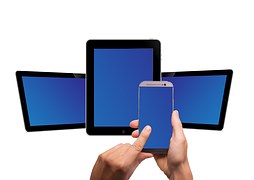
• Mobile Domination – Mobile will continue to outpace desktop as digital marketers experiment with more and more mobile searches, mobile payment methods, mobile apps, and mobile-only social applications to create brand value.

• Finally, search algorithms will change; and change again; and maybe even change again, proving that nothing ever stays the same in the SEO universe.

Steps to a Google-friendly Site

google-485611__180

There is no point in having a website unless people visit it. And people won’t visit it often enough, if it first doesn’t please Google, who, like it or not, is the most important arbiter of how your website will be ranked. So, while you are indulging in your creative fancies, trying to make you site the most beautiful and technologically sophisticated in the land, you also need to pay attention to grabbing the attention of Google – your new, best friend.

Number one on the list of creating a Google-friendly website is realizing that content is still king – not clever meta tags or sneakily inserted and endlessly repeated keywords. You have to provide unique content that is worth reading, viewing, or listening to, and that is updated regularly. And make sure that your content is original. Google is particularly annoyed when you lift content from another site and try to fool it into thinking that it is truly your own.

The good news is that if you provide unique and useful content, other sites will link to yours. Google likes that and attaches a lot of importance to inbound links. Again, don’t try to fool the Google algorithm; inbound links that are the result of schemes or link farms are a no-no. Google’s algorithms can distinguish natural links from unnatural ones.

Also, don’t try to out-maneuver Google by creating multiple pages, subdomains, or domains with duplicate content, or stuff pages with key words that don’t actually relate to the content therein. If your site contains pages, links, or text that you don’t intend visitors to see, Google considers those links and pages deceptive and may ignore your site, altogether.

Now, for the more technically minded, here are some other hints to making your site more Google-friendly:

• Ensure that your URL is optimized for organic search because its structure is important to its crawlability. Eschew unnecessary parameters and irrelevant characters.

• Test your page speed using Google’s own tool.

• Make sure that you’re not linking to non-essential pages in order to maximize your PageRank filtration

• If you’re using JavaScript, ensure that you’re coding it correctly so that it can be accessed by search engine spiders.

• Don’t use images to display important names, content, or links. Google’s crawler doesn’t recognize text contained in graphics.

• Use ALT attributes if the main content and keywords on your page can’t be formatted in regular HTML.

• Remember to create a Google Webmaster Tools account for your website so that Google can communicate with you directly.

A final word about the basics: Create your website for people, not search engines. The more usable your website is to humans, the more appealing it will be to search engines, anyway.

How Important are Mobile-Friendly Websites?

mobile-phone-579548__180

Here’s the quick answer: VERY. By 2017, it is estimated that there will be 150 million mobile websites – that’s 149 million more than there were in 2007. With 4 billion mobile phones being used, world-wide, it won’t be long before many people’s first internet experience will be through a mobile device. If your business doesn’t maintain a mobile-friendly website, you are missing the opportunity to attract customers over their mobile phones.

Google has already recognized this shift when it recently rolled out of a major algorithm update that is designed to allow mobile-friendly websites to appear higher in mobile searches, while non-mobile sites will experience lower rankings. So if you want your site to rank high in Google, it is now imperative that it is optimized for mobile.

However, SEO ranking is not the only reason to have a mobile-friendly site. The fact is, that sometime in 2014, mobile usage overtook desktop usage for the first time, ever. If your business’ site is not mobile-friendly, you’re running the risk of losing over 50 percent of your visitors. So if you want to keep the traffic flowing, it pays to make the move to mobile.

Here’s another reason. Optimizing a website for mobile has been proven to boost engagement by almost twice the average traffic per user. Since the vast majority of people tend to move between devices when completing a task, offering them an engaging mobile experience increases the likelihood that they will re-visit your website on a desktop.

Also, research indicates that consumers are more likely to do business with an online retailer if it has a mobile-optimized site. And finally, many smart phone users employ GPS when they’re on the go. A mobile-friendly site that allows consumers to find nearby services and businesses while still in their cars can increase walk-in traffic substantially. Not only that, the use of bar codes on a mobile-friendly site can be used for instant discounts by those same walk-in customers.

To sum up: SEO, traffic, engagement, and sales are four good reasons why your website should be optimized for mobile as soon as possible. And remember, your competition is already making the move. If you don’t want to be left behind in this next technology wave, you need to make the transition, now.