Tag: responsive design

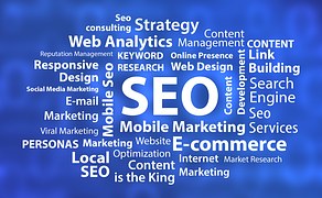
The Importance of Online Marketing in 2017

arrows-1915353_960_720

Ecommerce continues to grow and competition will ramp up, as well, in 2017. This means that customers will be harder to win, easier to lose, and fussier on price and user experience. The low barriers to entry and the fact that consumers can switch from brand to brand with the touch of a button, means that those who fall behind when it comes to customer experience and pricing strategy will lose out. So, the savvy online marketer will have to keep up with the latest trends in order to stay ahead of the pack.

Here are some tips for online marketing in 2017:

 Influencers are becoming increasingly important because they are considered credible and, unlike classic advertising, their opinion is trusted. To be successful in 2017, you will need to cooperate with bloggers, YouTubers, etc., and win them over with your products and services.
 Just as influencers need be enlisted, so must users. Users who are convinced of something are an ideal marketing instrument because they transfer their conviction to the wider market.
 Customers will have to be better informed and more inspired; it’s no longer enough just to offer products that are accompanied by a description. Shoppers want more. Products must be accompanied with ancillary information and collateral subject matter. The inspiring and informative incorporation of products and services into offers will influence purchase decisions and increase visitor numbers in 2017.
 Chatbots are small programs that function like a real chat partner. For this reason FAQs can be found on practically every internet site. But clicking through a long list of questions is often frustrating. Chatbots can perform these tasks considerably better. The user can ask his questions and the software answers interactively. Interested parties as well as customers arrive at their answers quickly, and receive the desired assistance in short order. So Chatbots will make customer service and customers’ lives easier in the year 2017.
 Live video is becoming increasingly important. With live streaming, the interested party feels more connected to what is shown. It’s an especially powerful tool to introduce a new product or service.
 Old SEO tactics are becoming outmoded. For example, beginning in January, advertising that customers are unable to bypass will be used as a criterion by Google to rank a site lower. So in addition to inspiring content in order to rank high, websites will have to put the user first. Say goodbye to annoying pop-ups.
 Native advertising is gaining importance. This includes articles in blogs, portals etc. that have not been created by an editorial team, but by an advertising agency or a company’s marketing department. Good native advertising is characterized by high-quality content. The reader is encouraged to read the article, although it is still advertising. (Native advertising should always be identified as such; otherwise blogs and advertisers are gambling with their credibility.)
 Virtual reality and augmented reality will make completely different marketing measures possible in 2017. They allow the user to be involved, and not just to stare at a screen.
 Platform as a Service is now one of the hottest trends in ecommerce. Just look at the incredible success of Platform as a Service businesses like Uber, Spotify, and AirBnB. The smart online marketer should consider selling anything that is used or consumed regularly via a subscription model. The high disposable incomes of today’s Millennials means plenty of cash for subscriptions, but their low wealth means there is never much in the bank for big one-off purchases. So, there really has never been a better time to sell your product via a subscription model.
 Mobile devices now make up over half of all web traffic and continue to grow in importance. However, mobile (phone and tablet), while accounting for 59 percent of all sessions by device on ecommerce sites, count for just 38 percent of revenue. In 2017, the smart online marketer will understand that mobile is king for research, but desktop is still where consumers do their buying.

How Much Should I Spend on My Business’ Online Presence?

seo-618434__180

The easy answer to this question is: “As much as necessary and as little as possible.” But, of course that’s the easy answer and in business, there are no easy answers. Some experts suggest that you allocate 15 to 20 percent of your company’s annual income for the best results, but that answer is also a little too facile.

You know that you’re going to spend something for your business’ online presence and you know that it’s probably going to more affordable than print ads, radio or TV commercials, or sending out actual mail. But what you really need to do before you spend a dime, is decide what you want to achieve, where you will find most of your customers, and what aspects of online advertising and communication will give you the biggest bang for the buck by generating leads and sales and directing people towards your company.

Generally, you will have several main choices for your online spending: a website, which requires building it, hosting it and maintaining it; search marketing, such as Search Engine Optimization (SEO), digital ads such as Google AdWords, pay per click (PPC) campaigns, etc.; a social media presence, such as Facebook, Twitter, and all the other various platforms; review site advertising such as Yelp and Foursquare; and email communication.

The most important of these is probably your website. There you have some choices. You can build it yourself using any number of off-the-shelf templates, such as WordPress, or you can pay to have one constructed for you. Your other basic costs will include a web domain, web hosting, a web developer (if your platform needs specific functionalities that are not available as plugins or extensions), and perhaps a social media manager (if you don’t have the time or the knowledge of how to manage the different channels). And remember: as the world becomes increasingly mobile-centered, it’s best to have a website that will display properly on smart phones and tablets.

Paying for SEO is another essential cost for many businesses. There are several models in play. You can pay a monthly retainer, which is a set fee each month in exchange for an agreed-upon array of services; or you can contract for services at fixed prices. Two other options are project-based pricing and hourly consulting.

Of course, you need to be on Facebook. It costs nothing, unless you wish to pay for boosting your content. The main expense is in labor. Facebook pages need to be updated constantly. In many companies, it’s a full-time job.

Sites like Yelp and Foursquare that offer customer reviews are also helpful tools for directing customers to your business through their advertising options. Most (non-PPC) advertising is priced on a CPM basis – essentially the cost per thousand impressions. You will have to do a lot of number-crunching to determine if this option will net you a decent return on your investment.

Finally, email marketing can be the centerpiece of any effort to stay in touch with existing customers, while reaching out and finding new ones. You can use it to promote new items and offer special discounts to loyal customers or to simply keep your customers informed. Blast email programs are relatively inexpensive, but you will need to pay a staff member to keep on top of everything.

Now, once you’ve done a lot of thinking, planning, and budgeting, you can re-ask yourself the question at the top of this post: “How Much Should I Spend on My Business’ Online Presence?” With all of your newly acquired knowledge, however, you will still likely wind up with the same answer: “As much as necessary and as little as possible.” Like we said, in business, there are no easy answers.

How Important are Mobile-Friendly Websites?

mobile-phone-579548__180

Here’s the quick answer: VERY. By 2017, it is estimated that there will be 150 million mobile websites – that’s 149 million more than there were in 2007. With 4 billion mobile phones being used, world-wide, it won’t be long before many people’s first internet experience will be through a mobile device. If your business doesn’t maintain a mobile-friendly website, you are missing the opportunity to attract customers over their mobile phones.

Google has already recognized this shift when it recently rolled out of a major algorithm update that is designed to allow mobile-friendly websites to appear higher in mobile searches, while non-mobile sites will experience lower rankings. So if you want your site to rank high in Google, it is now imperative that it is optimized for mobile.

However, SEO ranking is not the only reason to have a mobile-friendly site. The fact is, that sometime in 2014, mobile usage overtook desktop usage for the first time, ever. If your business’ site is not mobile-friendly, you’re running the risk of losing over 50 percent of your visitors. So if you want to keep the traffic flowing, it pays to make the move to mobile.

Here’s another reason. Optimizing a website for mobile has been proven to boost engagement by almost twice the average traffic per user. Since the vast majority of people tend to move between devices when completing a task, offering them an engaging mobile experience increases the likelihood that they will re-visit your website on a desktop.

Also, research indicates that consumers are more likely to do business with an online retailer if it has a mobile-optimized site. And finally, many smart phone users employ GPS when they’re on the go. A mobile-friendly site that allows consumers to find nearby services and businesses while still in their cars can increase walk-in traffic substantially. Not only that, the use of bar codes on a mobile-friendly site can be used for instant discounts by those same walk-in customers.

To sum up: SEO, traffic, engagement, and sales are four good reasons why your website should be optimized for mobile as soon as possible. And remember, your competition is already making the move. If you don’t want to be left behind in this next technology wave, you need to make the transition, now.

Apple’s iPhone 6 Release Highlights the Need for Responsive Design

The Apple iPhone 6 and 6+ have launched, and demand is so high users who order are facing order fulfillment delays reaching into October. The delays don’t seem to dampening sales, however. “Response to iPhone 6 and iPhone 6 Plus has been incredible, with a record number of preorders overnight,” Apple told the Financial Times.

To avoid these delays, users are waiting in long lines at the brick-and-mortar stores of major retailers and wireless carriers who sell the phone. “There are going to be ridiculously huge lines,” Tim Bajarin, an analyst with Creative Strategies, tells USA Today. “Demand for iPhone 6 is so high.”

Reports indicate many of those waiting in line may be app developers or their proxies. This is because developers are anxious to immediately update their apps to run on the new phone and new operating system. Apps for both Apple and Android products have skyrocketed, after all, following the general trend toward greater smartphone use.

What does this mean for businesses? To put it simply, increased. Just as the surge in internet use a decade ago drove companies online, forcing them to build an online presence in order to reach customers, the new wave of increased smartphone use demands that companies now field online sites that can be easily viewed and used on smartphones. When possible, companies are also developing apps to make connecting with customers even easier.

In the past, websites were designed solely for use on computers with relatively large monitors. As mobile internet was developed, users found these sites difficult to view and use on the smaller screens offered by portable devices. The original answer to this question was the development of separate, similar mobile sites designed to be easier to view and use on smaller screens.

The technology has advanced, however, and now websites can be built that automatically query the users device when they access the site in order to determine the size of the screen. Based on the answer, the site then chooses from one of several ready-made format options designed to best different ranges of screen sizes. This is called “responsive website design.”

40 percent of users will abandon a site that takes just three seconds to load.

Determining the right format for the user’s device isn’t the only key to responsive design, however. A properly designed website can also load faster on mobile devices. Even a good 4G connection loads slower than most wired or wireless broadband internet connections, and some flashy features like sliders and large-format graphics that look great on a large screen and load easily through a broadband connection can load dramatically slower on mobile connections. Responsive websites determine the user’s speed and delay or eliminate the loading of these bandwidths hog as necessary. Remember, as we have discussed in another blog article, 40 percent of users will abandon a site that takes as little as three seconds to load, and 79 percent won’t return to a site they previously had trouble loading. In this business, time is quite literally money.

How do you know if your site is responsive? Odds are, if your site wasn’t built in the last year or tow or hasn’t been extensively updated or overhauled in that time, it isn’t – or at the least isn’t using the current full capabilities of responsive design. Here’s a good way to check: Pull out your smartphone. Open your web browser. Enter your site address. If you can’t view or use the site easily, odds are your customers also can’t…or won’t.

If you need a responsive web site designed, or an existing website overhauled to be responsive, at The Click Experts, we can help. We know responsive coding inside and out, and have the knowledge and experience to put it to work for you and your business. This means we can build responsive designs into both template and custom sites. We also build custom apps for both Android and iPhone, so if your company wants there to be “an app for that”, we can help. We offer free quotes, so there’s no excuse to check and see how custom apps and/or a website featuring responsive design can benefit your business. Don’t lose customers due to bad design. Contact The Click Experts today!

Apple introduces the new iPhone 6: